


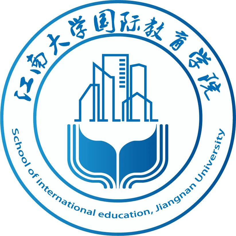
— 国际教育学院 —
院标设计大赛获奖名单
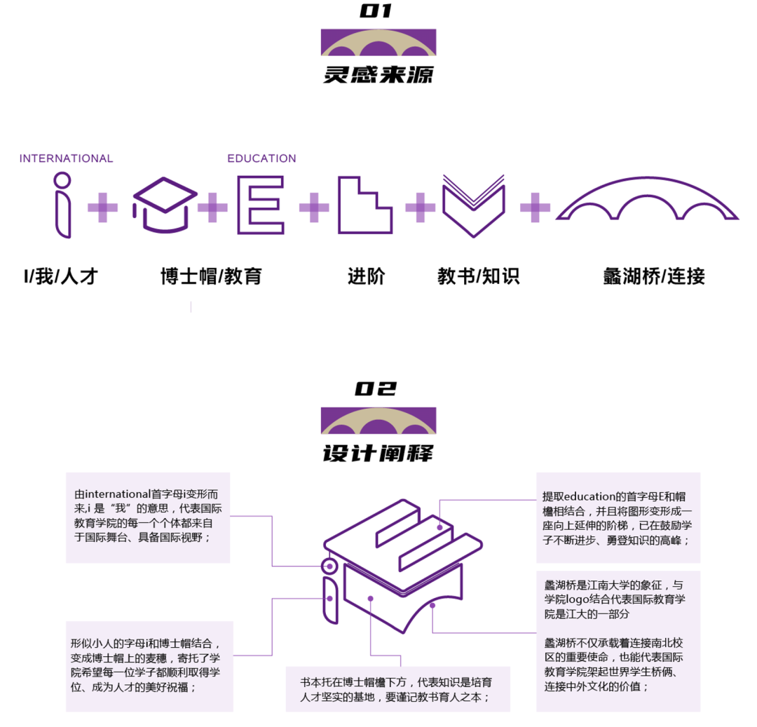
自2022年3月国际教育学院院标设计大赛开展以来,征集活动受到广泛关注,最终收到近40件参赛作品。经过筛选评比,我们选出入选作品1件,入围作品5件。下面让我们来欣赏一下吧!
Since the beginning of SIE LOGO DESIGN CONTEST in March, 2022,we have got extensive attention from different schools and departments in the campus. By the end of the contest, we have received nearly 40 works. After careful review and selection, we have selected one as the official Logo and 5 shortlisted works.
入选作品 First Prize
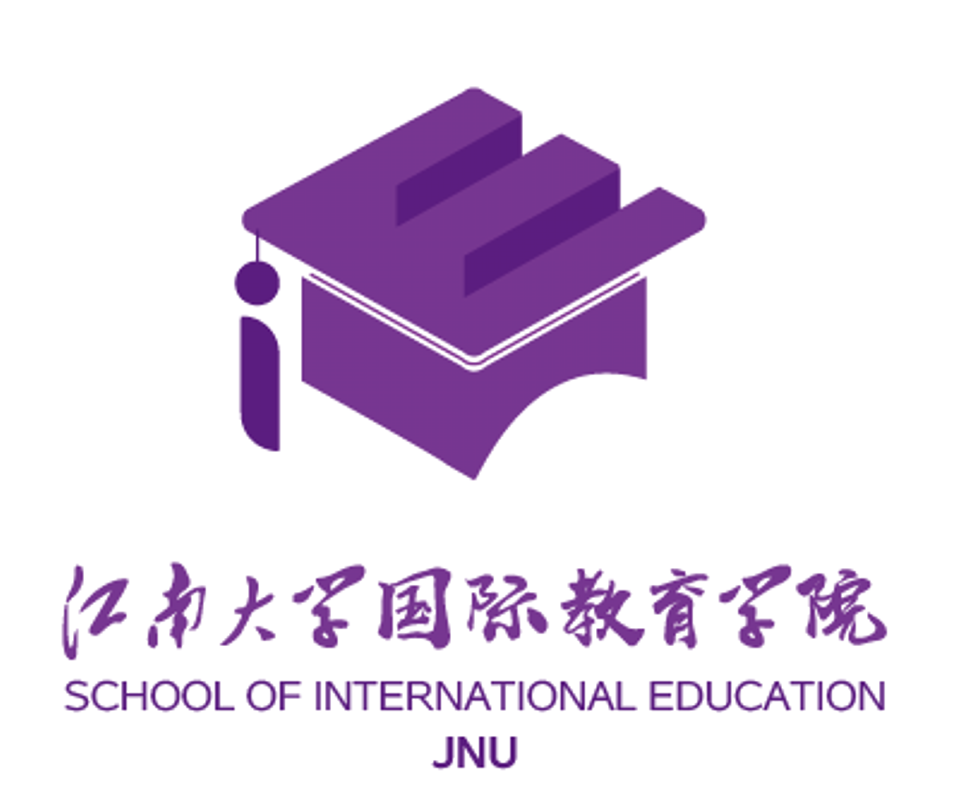
Designer:王晓欢(Wang Xiaohuan)
alumni, graduated in 2016, School of Design, Jiangnan University
Design concept:
以梦为马 不负韶华
入围作品 01
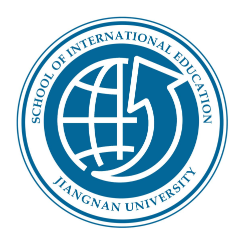
Designers:
David Bestman, Class of 2019, undergraduate, School of Design
Francis Kelvin Kangar, Class of 2019, undergraduate, School of Business
Diana Z. Dahn, Class of 2019, undergraduate, School of Design
Thomas Massaley, Class of 2019, undergraduate, School of Artificial Intelligence and Computer science
Design concept:
Our design comprises circles and a globe with an arrow. The circles are used to send a positive message of harmony and protection found in Jiangnan University. It also represents Jiangnan people’s continuous development and self-empowerment. The Globe symbol represents the international connectivity Jiangnan University has with the rest of the world. The Arrow points upward symbolizes Jiangnan growth and prosperity and the desire to prepare every student to reach the peak of their career.The font used in the logo is called Book Antiqua unfolding reliable, respectable, honesty, and Neutral. Among many universities, Jiangnan University remains committed to its heritage, global vision, and determination to establish a reputable institution with distinctive characteristics locally and internationally. The calm colors signifies knowledge and integrity.
以梦为马 不负韶华
入围作品 02
Designer: Kader Ali Ibrahim
Class of 2018, Phd student, School of Internet of Things Engineering.
Design concept:
In a simple description School of International Education is located inside of Jiangnan university. Jiangnan university is in China. However, China is located on the map world. Human being live in the earth so far but maybe after several decades human being will move to Planet Mars. School of international Education, Jiangnan University is the core of the world(Global Vision). And the human being is the core of world (Unchained Affection). So this new logo is in perfect harmony with the slogan of the logo.Any international student who come to our School of International Education will get Jiangnan mind set which is Global Vision, Future Mission and Unchained Affection.
以梦为马 不负韶华
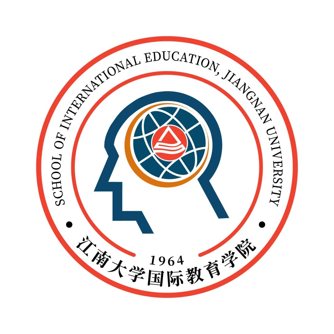
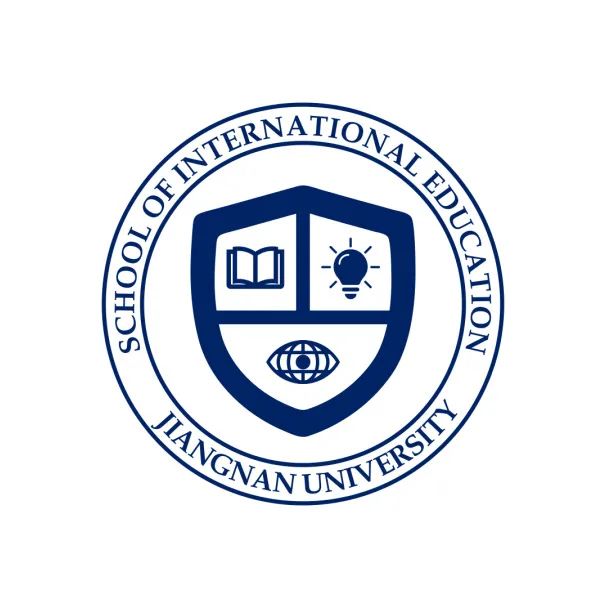
入围作品 03
Designer: 李绵 (Li Mian), class of 2021, master student, School of Law
Design concept:
本设计总体与学校校徽相互呼应。采用写实加写意的创作手法。中心部分分为两个层次。第一部分是以学校剪影为主体。第二部分是既像“流动的水”,又像一副“宽大的手掌”。水,至柔,象征着包容万物,这也寓意着国际教育学院开放包容,海纳百川的办学理念;“宽大的手掌”向上托举着,寓意着国际教育学院是江南大学坚实的基础之一,体现出国际教育学院是江南大学不可或缺的一部分。同时,为体现学院的“国际视野”,院徽采用国际范的空军蓝,寓意着飞出国门,走向世界。
The design generally echoes the school's logo. The design is a realistic and imaginative approach. The central part is divided into two levels. The first part is a silhouette of the school as the main body. The second part resembles both 'flowing water' and a 'broad palm'. The "broad palm" is held upwards, signifying that the School of International Education is one of the solid foundations of Jiangnan University, reflecting that the School of International Education is an integral part of Jiangnan University. At the same time, in order to reflect the "international vision" of the College, the emblem adopts the international air force blue, which means flying out of the country and going to the world.
以梦为马 不负韶华
入围作品 04
Designer: 任轶博 (Ren Yibo)
alumni, graduate in 2013, School of Design, Jiangnan University
Design concept:
蓝色代表着和谐与开放的学院底蕴,整体由“国教”拼音首字母缩写“G”和“J"为主体,共同组成一个“地球”的形状,代表着面向世界,面向未来,兼容并包的时代精神。同时,标识倾斜66.34°,与地球自转轴的角度相同;标识也是一个对话框的造型,体现出学院营造师生情感交流,和家校沟通的开放环境;标识整体又像一个“眼睛”,体现学院“国际视野,未来思维,江南情怀”的院训。
The blue colour represents the harmony and openness of the College, and the whole is made up of the initials "G" and "J", which together form a "globe". The logo is made up of the initials "G" and "J", which together form the shape of a "globe", representing the spirit of the times, which is open to the world, to the future and to inclusion. At the same time, the logo is tilted at 66.34°, the same angle as the Earth's rotation axis; the logo is also in the shape of a dialogue box, reflecting the College's open environment for teachers and students to communicate emotionally and with home and school; the logo as a whole also resembles an "eye", reflecting the School's motto of "Global Vision, Future Mission, Unchained affection".
以梦为马 不负韶华
入围作品 05
Designer: Peter Sunday Bulus (周日)
Class of 2019, master student, School of Biotechnology.
Design concept:
The idea is to reflect the characteristics of internationalization of the school and also to conform with the spirit of the school motto which is "Learning and Practicing unto Perfection".
以梦为马 不负韶华
Congratulations and thank you for your participation in this contest, as well as your attention to SIE, JNU!